ProcessUser research and synthesis, ideation, prototyping, interaction, usability testing
My Role
UX/UI designer
Tools
Figma, Photoshop, Optimal Workshop
Duration
May-Dec 2024
Social media engagement:
Market growth:
Demographics:
I analyzed 3 different apps available on iOS. While some included many great features such as project reminders, organization, and row counting, none encompassed all of the above. These gave me an idea of where I wanted to start, but did not address all of the problems that users may face.

There were a total of 5 participants, each of which were at least at a beginner crochet level.
Each interview included (but were not limited to) open-ended questions about...

After synthesizing my interview research using affinity maps, I created two personas that represent different types of crocheters.


This made me think...
Thinking on that HMW question, the following ideas were generated using creative constraints, analogous inspiration, and by playing with opposites.


I went on to narrow down these ideas into the ones selected below. I felt that these were all great ways to address my personas' problems of burn out or finding inspiration.


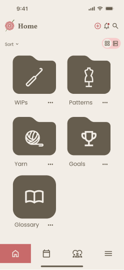
The home page became the main focus starting out. I sketched out 3 pages, picked my favorite elements from each one, and created a refined home page using those components.
.png)

Next I created two task flows. The first task flow became a main feature, allowing users to save projects in an organized way. Whether it was a work in progress or a finished one, they have the option to save it into the folder of their choosing.
The second task flow focused on the social aspect of the app. This shows how a user would share their creations with other Yarn Circle users.


For the moodboard, I gravitated towards crocheted items that despite being man made, looked rather natural.
Consistent themes that came up were warm, earthy colors. The main goal was to lean into a cozy, comfy theme with high readability for all users.
I checked contrast according to (Web Content Accessibility Guidelines) WCAG, to make sure it was accessible to users.


Click to images below to view in full size!
With the initial design, I wanted to keep the logo as accessible as possible. After getting feedback from group critique, I realized that I had sacrificed the brand identity to ensure its readability. So with further iteration I was able to design a far more fitting image that retains its accessibility, while also mimicking a "magic ring," a common technique used to begin crocheting in a circle. To further drive the cozy branding, I chose "Comfortaa" for the logo's typography.


I aimed to capture the functionality of Google Drive, but have it be more specific to the needs of a crochet user. In the home page, users have options to create a new project, folder, goal, file, or keep track of their yarn inventory.


Users can set deadlines or reminders for themselves in order to stay on track of their projects.
Users have the option to join the Yarn Circle Discussion tab to share their latest creations or interact with other hobbyists to stay inspired.


The main goal was to assess if users can navigate through the Yarn Circle app with ease and ensure that the layout of the app design is consistent with user expectations.
A total of 6 volunteers provided feedback for usability testing. Their commentary during each session was taken into consideration for further iterations.
Priority went to the calendar, as most users experienced issues when trying to edit events.
Suggestions for additional features were low priority since some do not correlate with existing task flows.
Working on Yarn Circle was an enriching experience. I wanted to address a critical need in the crocheting community by combining practical project management with social connection in a single platform. Throughout the design process, I found it quite challenging to balance functionality without overwhelming users. So instead of keeping projects and socials separate, I wanted Yarn Circle to encompass both as it was a common theme during research.
This project taught me the value of user research, especially when designing across generational technical gaps, creating a flexible organization system, and iterative testing with community members. It was exciting to design something for a hobby that I also enjoy, so a lot of love went into this design. Going into this project I already had a few ideas in mind for this app’s design, but I now recognize that staying open-minded during research was going to address the needs of an entire community, rather than my own needs or presumptions of others’.
And that is something I will take with me in any future projects.
In retrospect, I would have loved to conduct more diverse user research and testing earlier in the design process, as well as incorporate more accessibility features.
To further improve the project, I would like to expand on the glossary and include short-form media tutorials on specific stitches, as well as include a community gallery of finished creations for users to browse.